With my love for the game of football, I chose to do a rebranding logo for a team I played for back in 2011. I just loved the colors, mascot, ownership, and the fans. I did like the original look of the team logo. But as I got older, like other things that have changed, this was one thing that I would like to see an update for. I came up with my own. Enjoy!
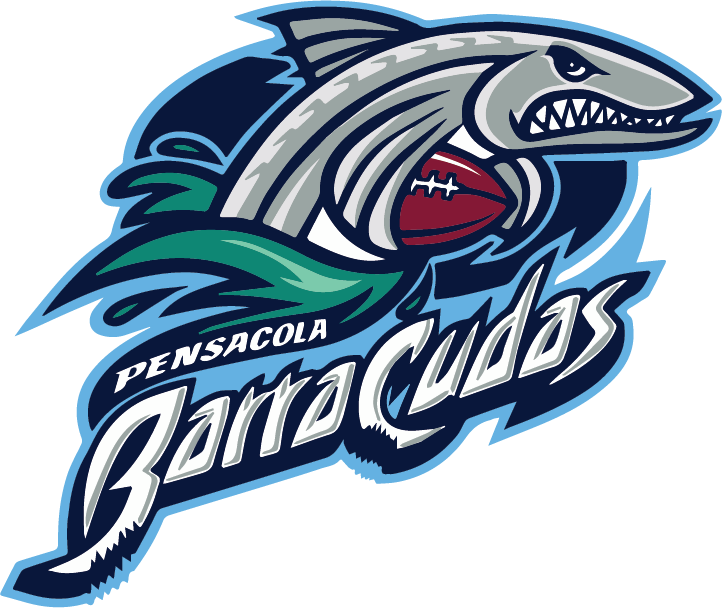
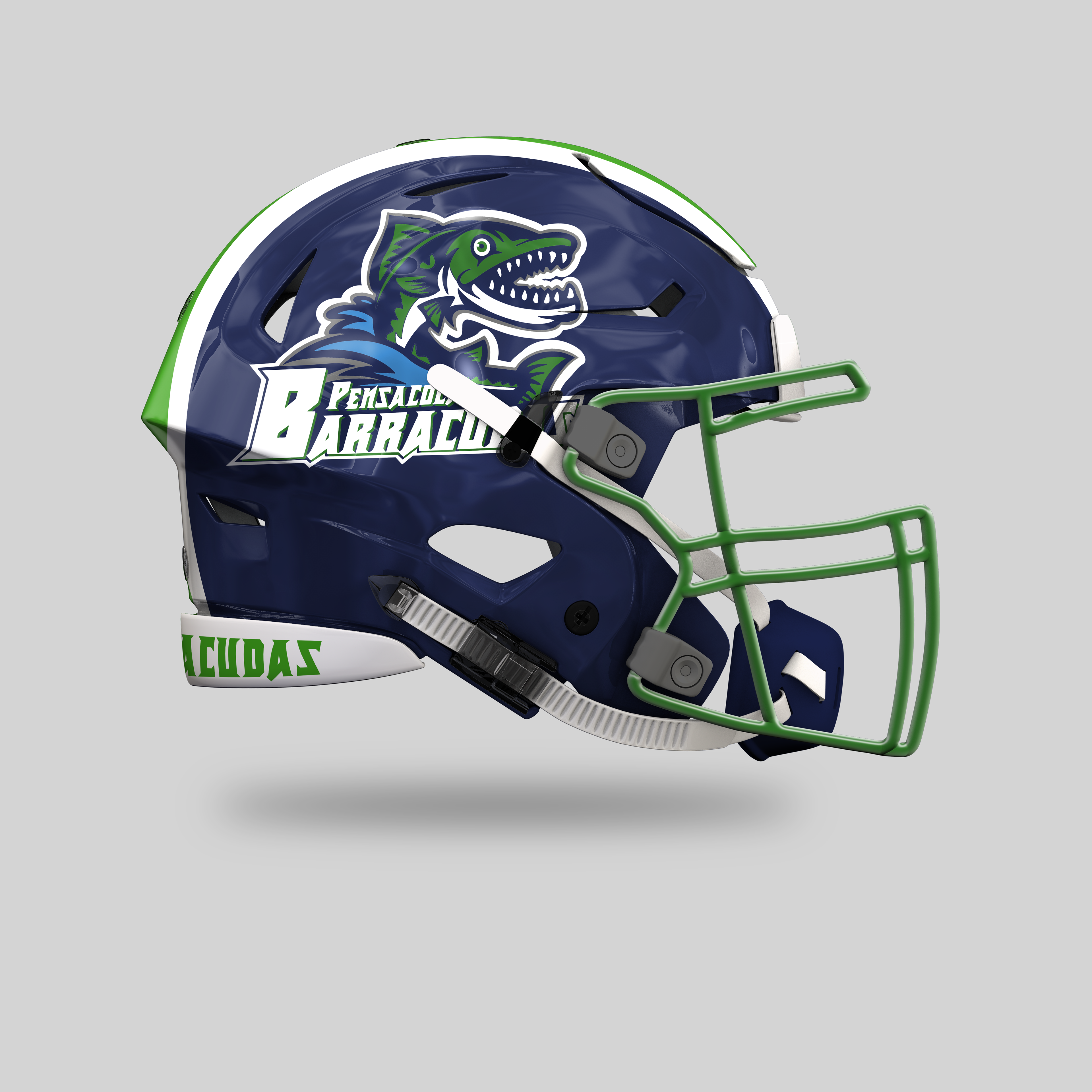
This is one old Pensacola Barracuda team logo. In my view, I do somewhat like it, but I think it has too much color and detail for a helmet, and its font is outdated. I wanted to keep the same pose, take the football away, and cut down on the colors and detail.
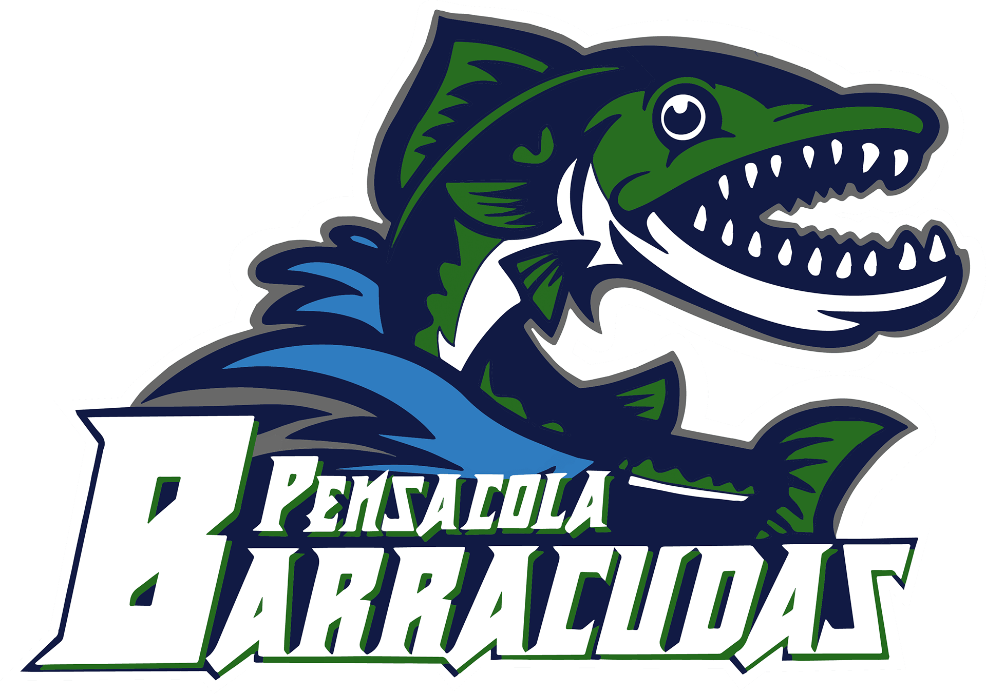
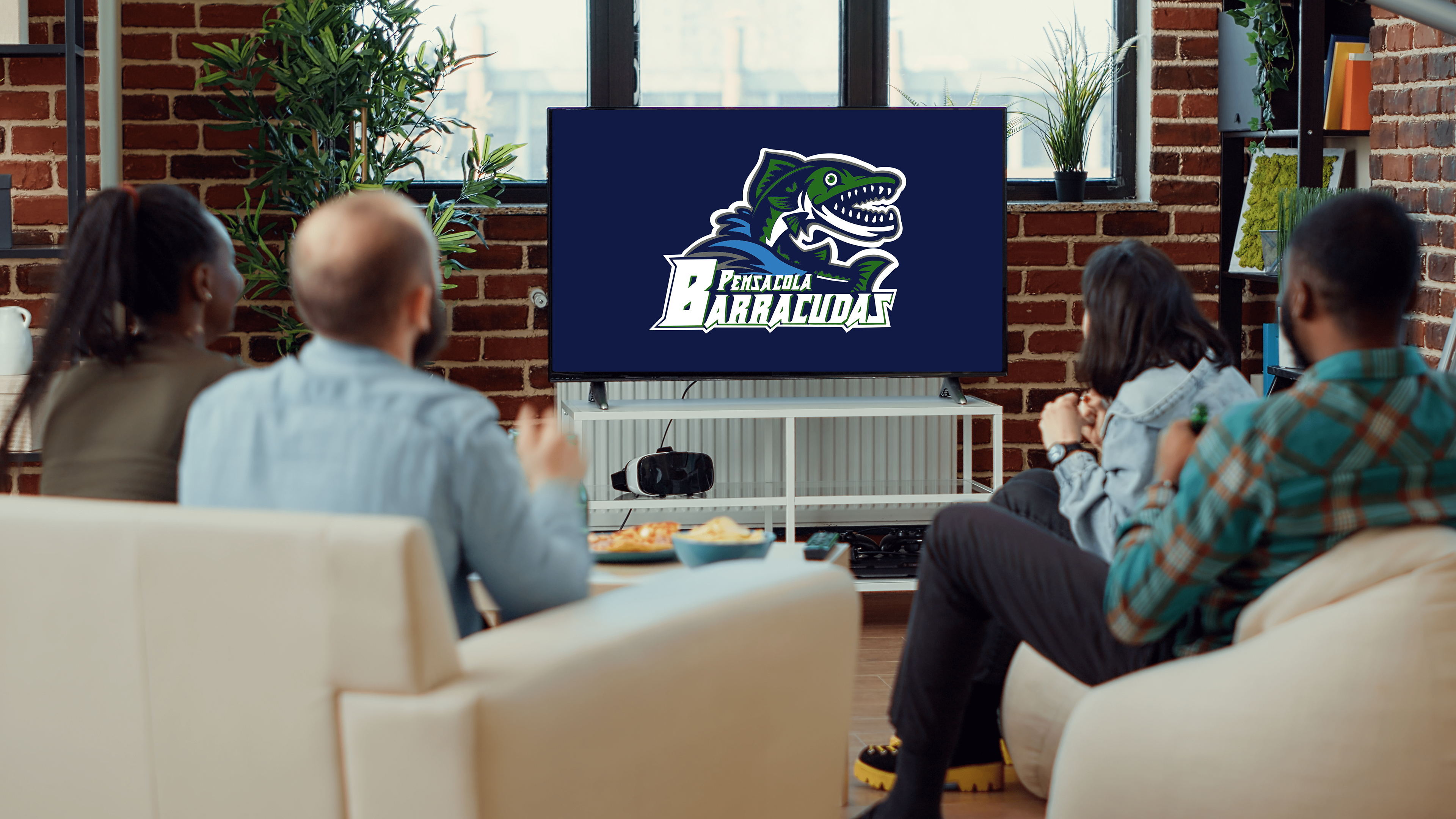
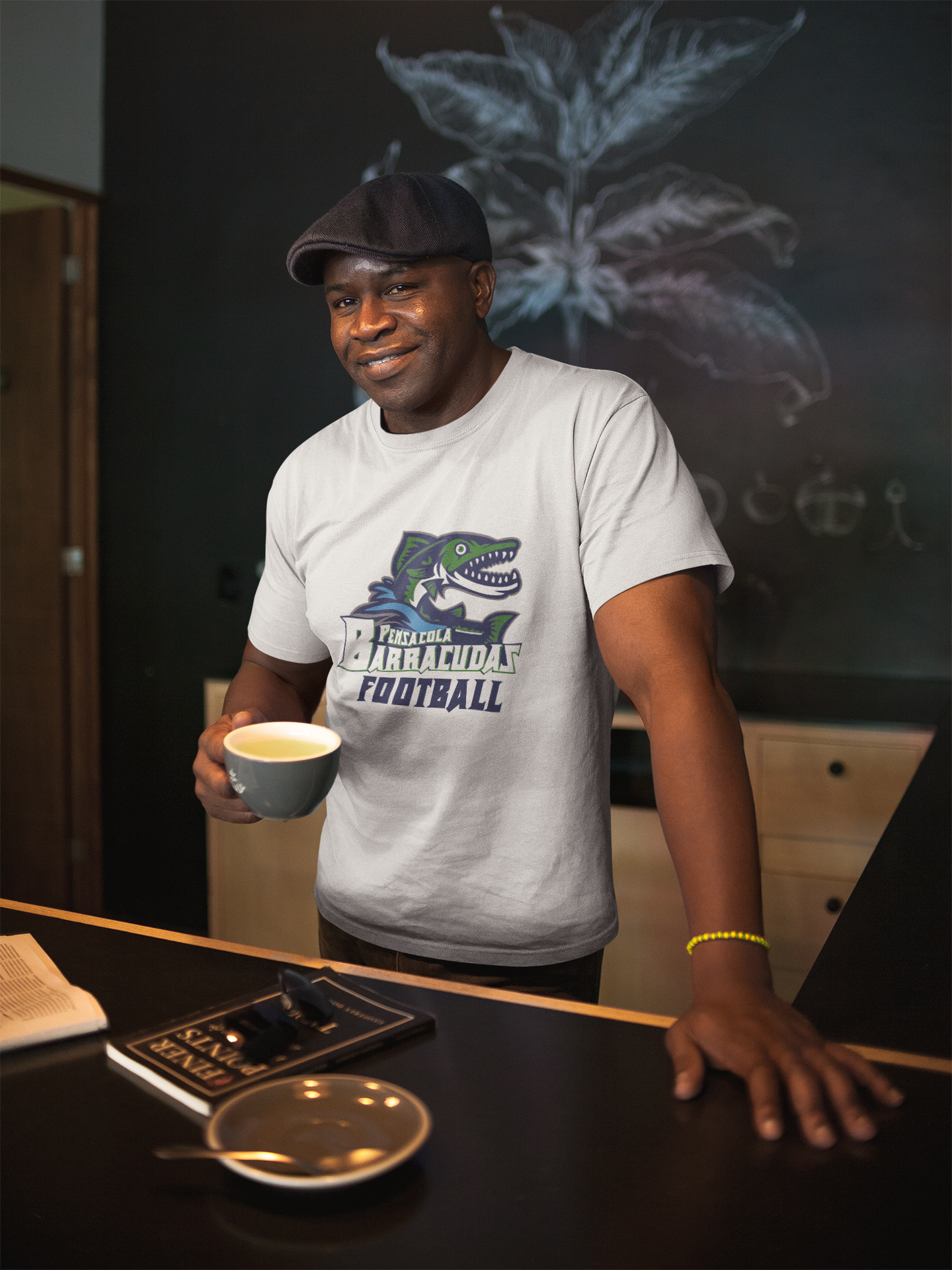
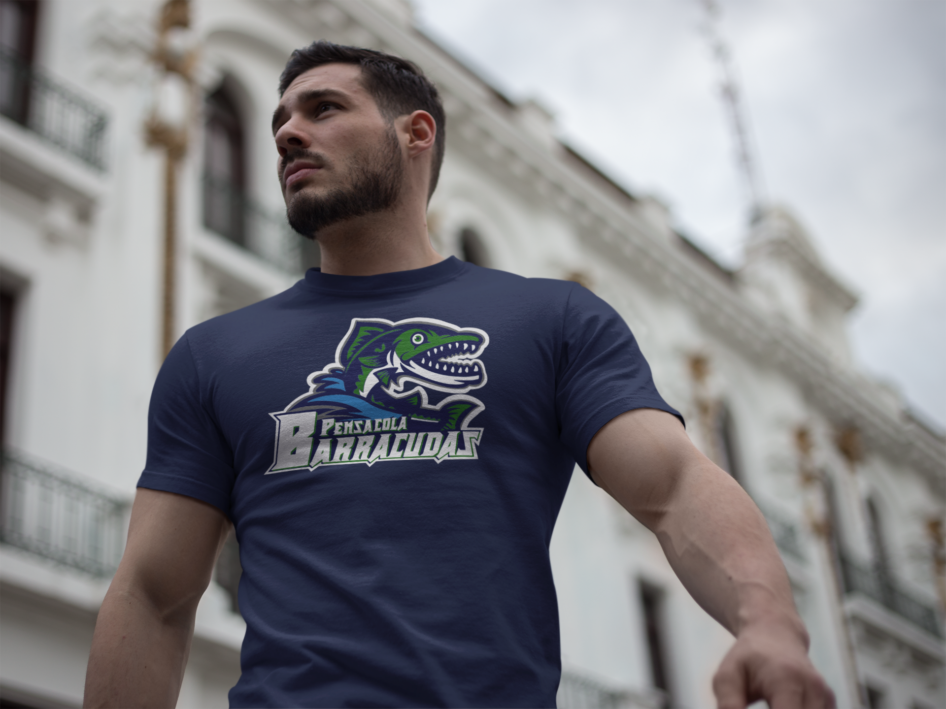
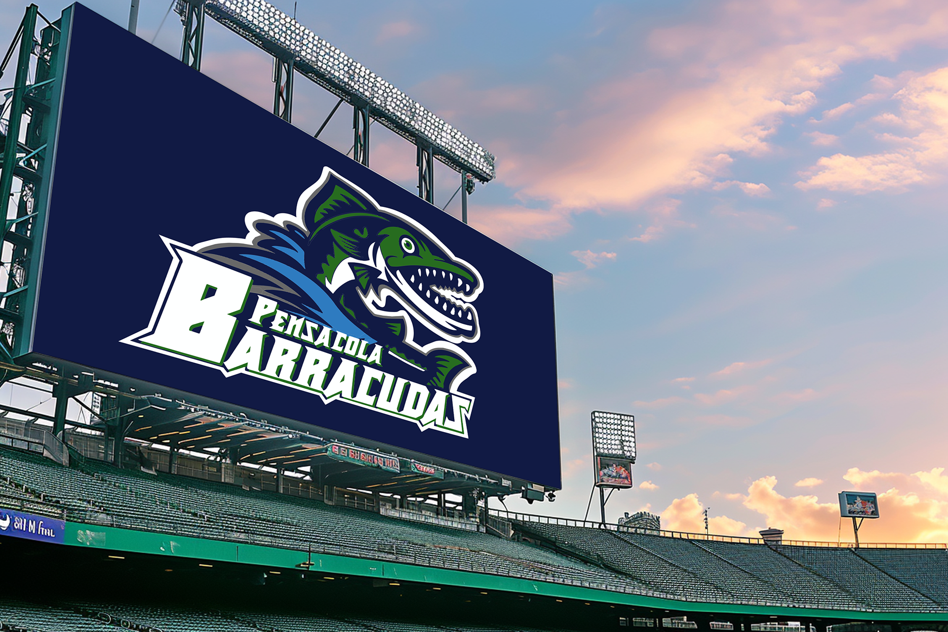
The newer Barracudas look has somewhat the same pose and the same colors. I got rid of the grey on the barracuda and made him green with a navy shadow and a white belly. The splash is still that baby blue color, and the whole image has a grey-and-white outline to it. Then, lastly, the font changed to a sharper look and leaned more to the right to look like a fins.
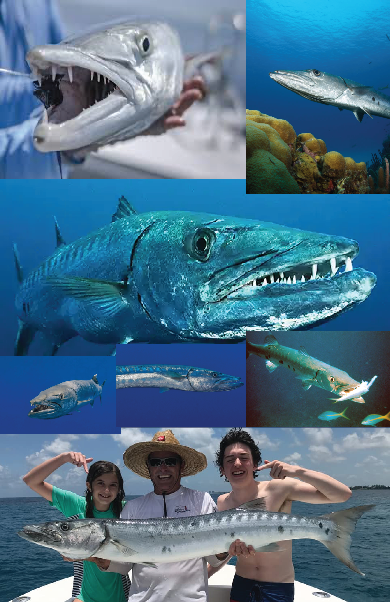
I wanted to keep away from the original look and keep the same perspective simultaneously. So, I went with these images to help with how a real barracuda looks, thanks to these images I found on Google for inspiration.
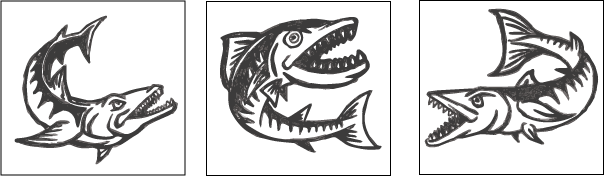
I wanted to draw something aggressive, like a cartoon character. Then, I did some light-to-dark shading of each barracuda, sharpening and rounding the fins and teeth.
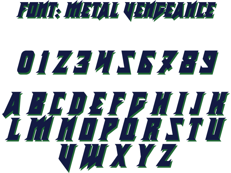
With fonts, I was looking for something that would match the barracuda look. These looks would be a sharp fish hook look or a sharp fin and teeth look. I wanted to go with a font called Metal Vengeance because it expresses the points I was looking for.
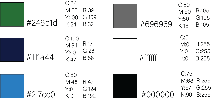
With the colors, I wanted to go with the same color scheme as the older logo but with a slightly darker scheme. The reason for that is that the Gulf of Mexico is a darker water than the Atlantic and Pacific Oceans. I made the green, navy, and white more dominant. The baby blue and silver, not so much when it comes to the football uniforms and so on.
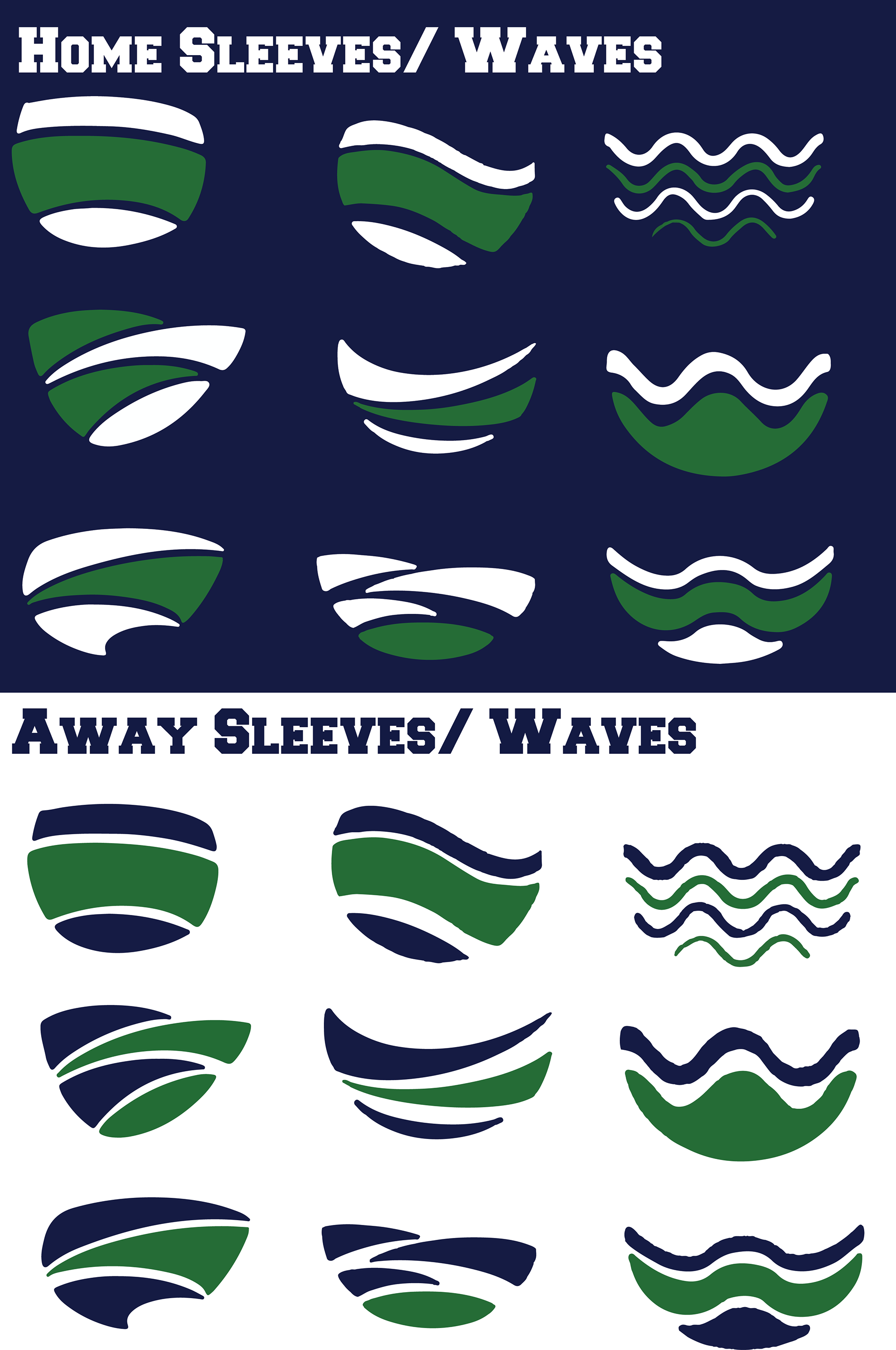
With each team, whether it be youth, high school, college, or professional, they all have a design added to them that shows off who they are. That type of design can be anything from duck feathers, like what the Oregon Ducks wear, to Bengal stripes that the Cincinnati Bengals have. With this, I wanted to do the same with this team. I went with waves on the sleeves of the jersey and down the sides of the pants.
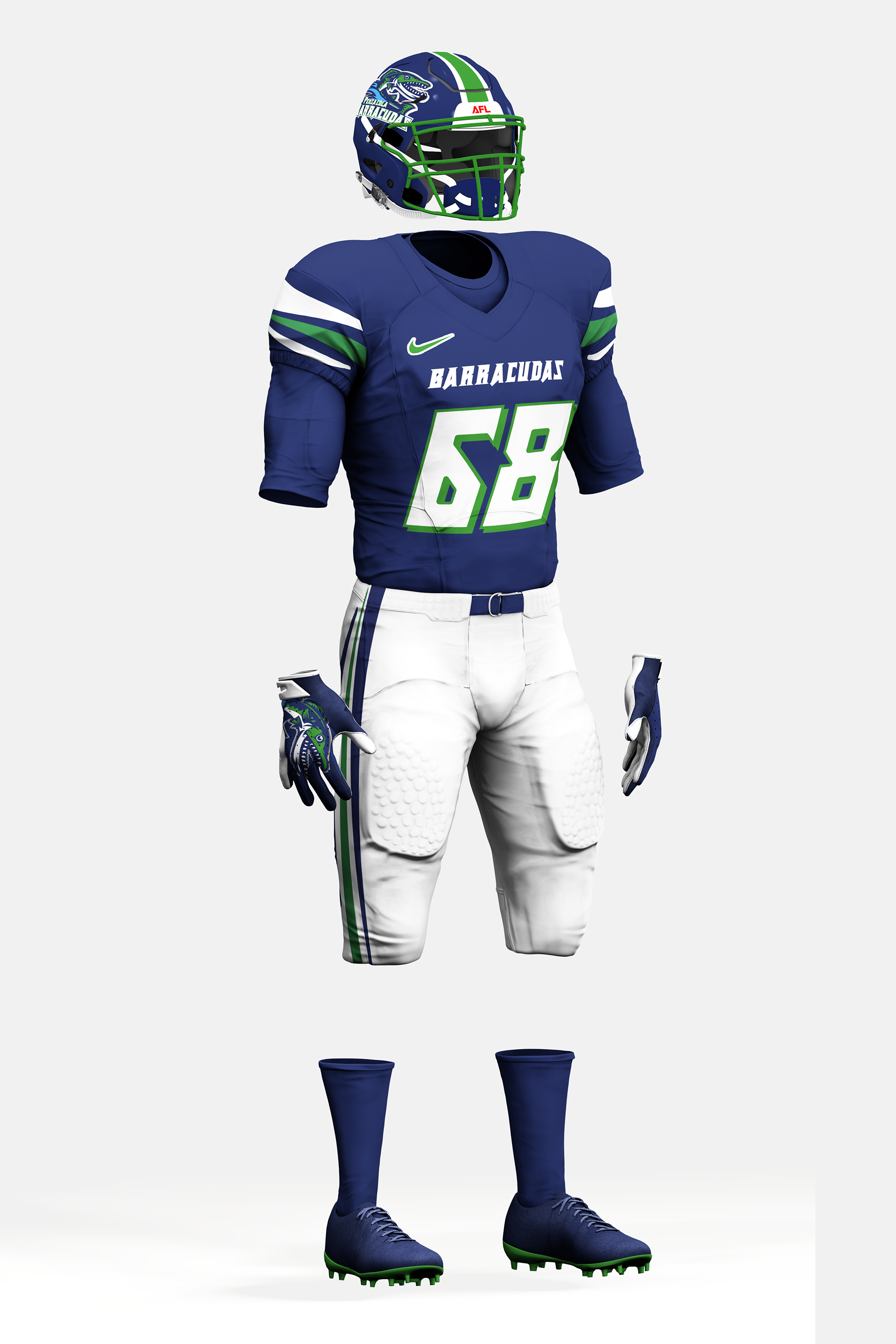
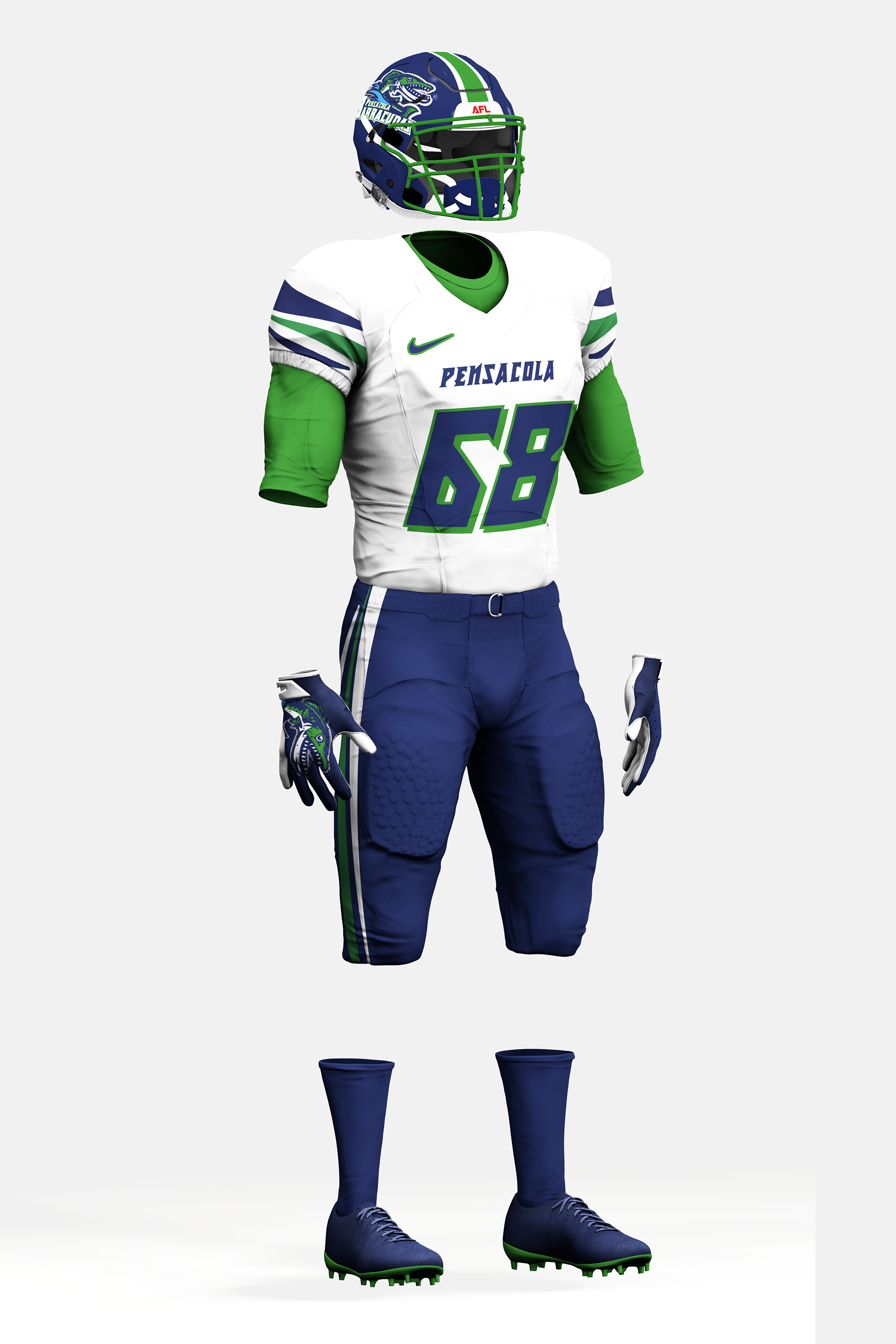
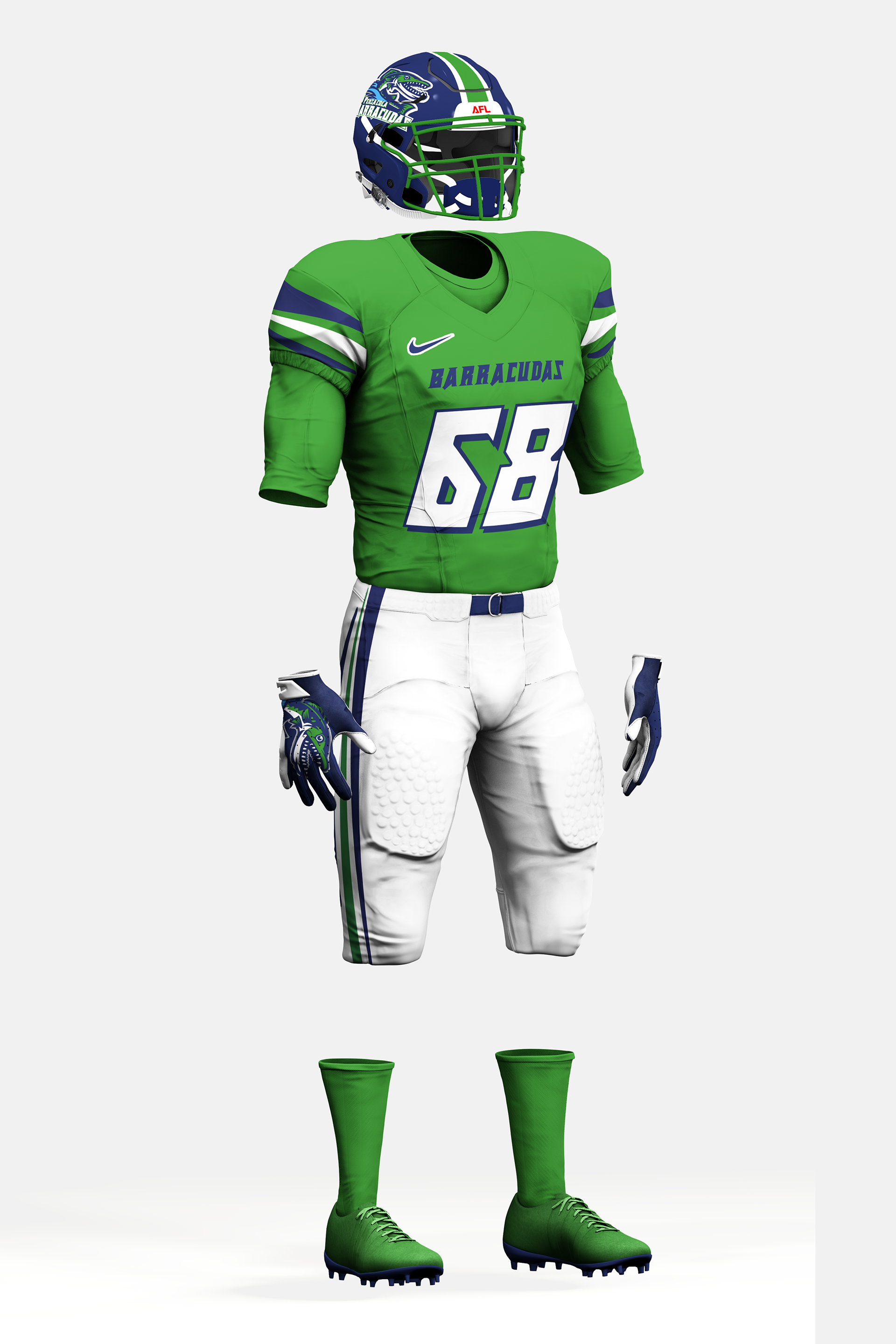
This is what my rebranding of the Pensacola Barracudas would look like. The team would still keep their traditional navy and green colors with just some new features added to the uniform. I chose to keep these colors because no other professional team in the state of Florida uses these colors. Next, the fonts for the numbers and the team name on the chest would be a Metal Vengeance to give a fishing hook look, this is also different from the logo font that’s on the team’s Barracuda logo. For the home and away uniforms I wanted to keep a basic look traditional look. This look is also what the previous team did, with a look of the navy jersey and white pants at home and the white jersey and navy pants away. The last would be the sleeves and the side of the pants. I gave this a wave look nothing too strong or nothing too calm. I wanted to meet some medium-wave feel that you may encounter in the Gulf of Mexico.