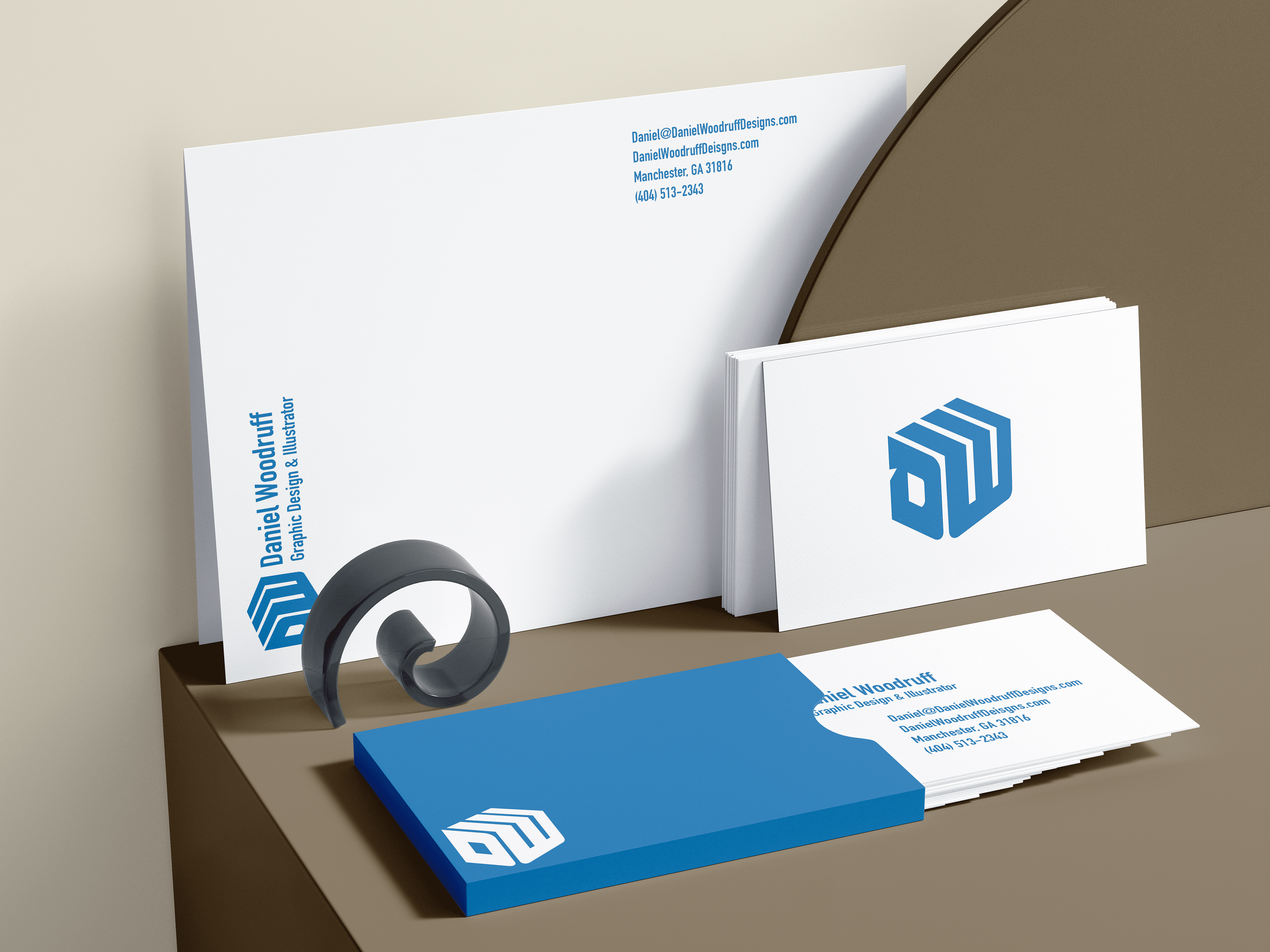
I developed a self-logo for this project to help promote myself. I wanted to use something easily recognizable when targeting the viewer.

So many ideas I just ran with my mind wide open on this project. I started off liking some of my cattle branding looks, but that would soon change to a 3D DW box look! #5

I decided to go with this 3D block look. I thought it was something that I had not done, and it would be easy to stand out from other business logos. I loved how the W folds back over the D. Then how they both are aiming toward the middle.

After finding what logo looked the best for me, I had to show different concepts of the same logos with different colors. In the end, I went with a Honolulu Blue, and as you can see, I added the hex code. #0076B6.
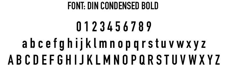
For my type, I wanted to go with a bold look with the logo but to much the same that the logo and text look so much alike. Just enough to where it can be presentable and look professional at the same time. The type I went with is DIN Condensed Bold, which I thought looked great with the DW logo.